Sway
Website Redesign

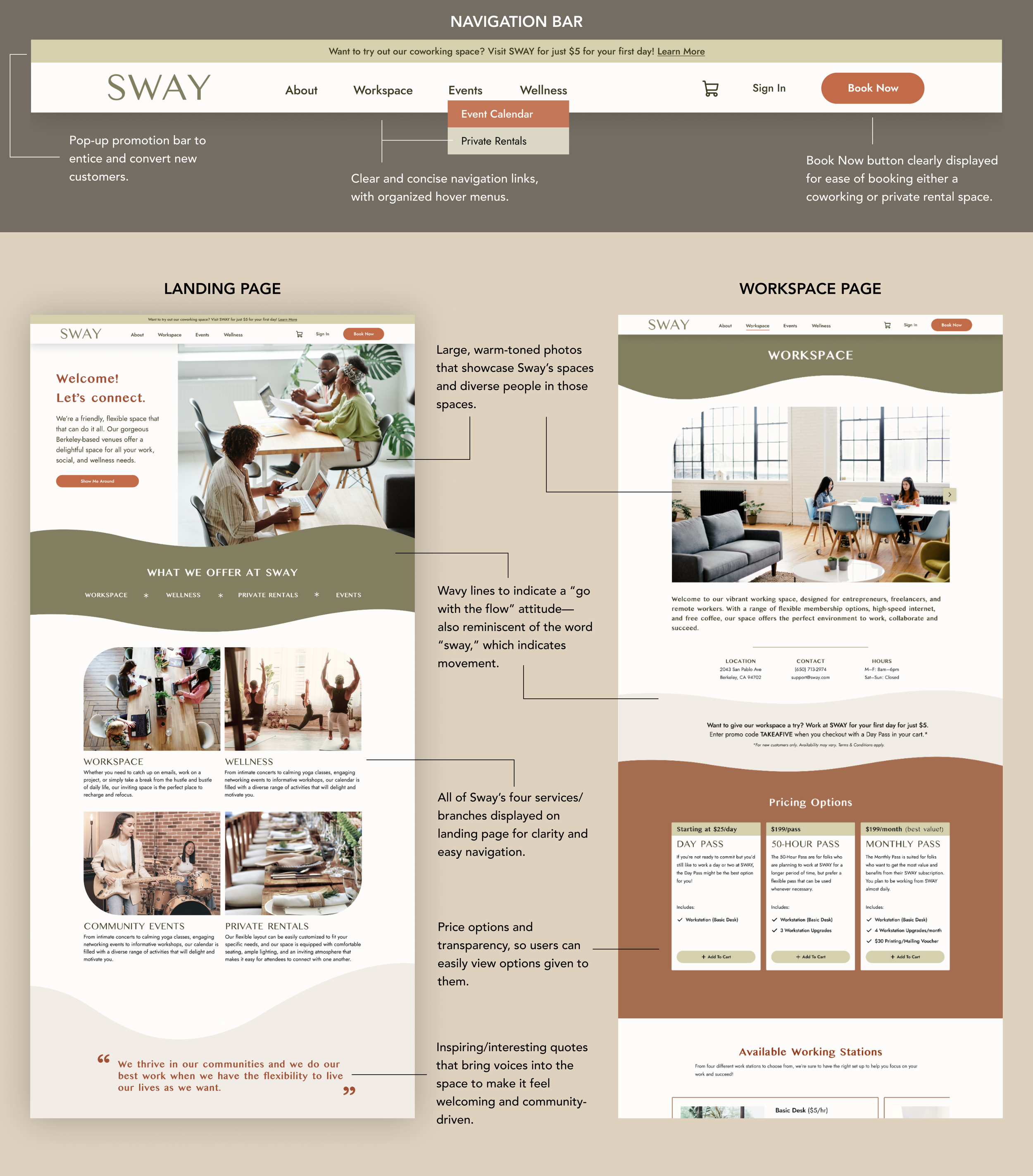
Landing page
Sway is a flexible space—it is a coworking space, hosts private rentals, provides wellness classes, and puts on community events. Sway’s previous website was did not clearly display all of Sway’s services, was difficult to navigate, and was void of personality.
This landing page showcases Sway’s new visual branding, creating a warm and inviting site that clearly lays out all of Sway’s offerings. We hoped to create a digital space that would feel like a community club, and that was easy to use.

Workspace page
Sway started out as a coworking space, before adding on all its other services. I focused on redesigning it’s Workspace page, to clearly show what kind of workspaces were available, coworking packages, photos of Sway’s gorgeous space, and an FAQ section.
This Workspace page could act as a template for Sway’s other pages, as it makes use of many components like cards, carousels, expandable lists, and more.

Booking Tool
On Sway’s old site, a large source of frustration for users was when they tried to book either a coworking or private rental space. I focused on redesigning these tasks to make them more intuitive to use.
Overview
Product
Workbistro—now known as Sway—started out as just a coworking rental space in Berkeley, CA. But since it opened its doors a few years ago, Workbistro has transformed into multiple-purpose business. Not only is Workbistro (a.k.a. Sway) a coworking space, but they now also hold event rentals, yoga classes, intimate concerts, and other community events.
Problem
Workbistro wants to rebrand themselves as Sway, and in the process update their website to reflect their new brand and business services. Workbistro’s old website at the time was difficult to navigate, suffered from an identity crisis, and did not clearly reflect what services they offered.
Opportunities
With this project, Workbistro/Sway asked me to help them rebrand and redesign their website to make it more user friendly and to create a digital space that accurately depicts their new identity and all the services they offer. In turn, they are hoping to attract more customers and increase revenue
UX Researcher, UX/UI Designer
Role
Figma, Calendly, Tactiq, Loom
Tools
6 weeks
Duration
Skip to Section
Meeting with the Sway Team
The Business
Workbistro initially opened in 2021 as a “flexible workspace” or coworking space in Berkeley. Since opening, they now offer private rentals (through a different business name, Flowspace). They also host a number of wellness/yoga classes and community events like concerts in their space.
They are now rebranding themselves as Sway, using it as an opportunity to present an updated, cohesive business identity.
The Physical Space
At the time, Workbistro/Sway had two spaces, both located in Berkeley:
A main, larger space for coworking during the day, and event rentals in the evening/weekends
A smaller space space for event rentals, concerts, yoga classes, etc.
The Website
Scanning their existing website, I initially noticed that the brand looked generic, using flat illustrations and sans serif fonts that have become popular on tech sites. The site navigation was confusing and the booking features were difficult to use. Exploring the site left me with the sense that the business was a bit all over the place.
*See carousel below for screenshots of the old Workbistro/Sway website.
Q&A with the Business Owner
-
Positive. Balanced. Focused.
-
We want to convert visitors on site to become subscribers/users.
We want the website to clearly show all the services and events that we offer.
We want to build a stronger brand to build a Sway “community club.”
-
We want customers to feel at ease and supported in our spaces. We also want the spaces to feel intuitive.
-
Since there are four sectors within sway (workspace/coworking rentals, wellness, events, and private rentals), we have 4 different groups of customers we are targeting.
You can view the 4 user personas we have built in this document here.
Images of the Company’s Existing Website
Research
While I had my initial assumptions about what needed to be fixed on Workbistro/Sway’s existing website, I knew I wanted to collect some more data before moving forward with any design decisions. I opted to conduct user interview that were more akin to usability testing, to do an initial site audit and gather feedback from users.
Sway’s business owner also gave me a list of their competitors, and I looked at some of these businesses to see how they marketed their services. This all helped inform me on how best to approach Sway’s website redesign.
Defining the Goal
I wanted to know how users interacted with and felt about the existing Workbistro/Sway website, so I could understand what was and wasn’t working for users and see how I could optimize the website to be a more user friendly and attractive space.
Methods
User Interviews (Website Audit)
Competitive Analysis
User Interviews & Website Auditing
Research
Overview
For my user interviews, I had my participants do some usability testing on Sway’s existing website to determine what was working and what wasn’t for users. I gave testers a number of tasks to complete on the website and recorded how they navigated the tasks, how they felt about the brand and services, and any other reactions to the site.
Participants
I interviewed five people, 3 women and 2 men, ranging from 27–36 years old.
Website Audit
I asked participants to complete 4 tasks on the existing Workbistro/Sway website to evaluate how they navigated, used, and reacted to the site.
-
Task 1 – Explore the site and learn about the company and its services
﹡ All 5 users said they were confused about the business, including what their services were and what spaces they offered.
﹡ 3 out of 5 users noted that the company’s identity seemed unfocused or unclear.
-
Task 2 – Book a standing desk in Workbistro’s coworking space
﹡ 4 out of 5 users expressed frustration booking a coworking space with the booking tool.
﹡ All 5 users experienced functional issues that prevented them from completing tasks on the website.
-
Task 3 – Find the wellness events calendar and book a yoga class
﹡ 3 out of 5 users were surprised that the company offered yoga classes.
﹡ 4 out of 5 users easily navigated to the Events page to find the yoga classes offered.
-
Task 4 – Book a private rental space for 20 people
﹡ All 5 users experienced navigational and functional issues trying to book a private rental space. They were all extremely confused by the Flowspace site redirection.
﹡ 2 out of 5 users said they wished there were more photos of the spaces.
Interview Takeaways
The site needs to better represent the company’s brand and mission, and it needs to better market the services they offer.
Both the coworking and private rental booking features were difficult to use, and need major improvements.
Most of the users liked the idea of having wellness classes and events at the space. The site could lean more into feeling more like a welcoming, community space.
The site navigation needs to be more intuitive for users. Navigation and rental booking features are major pain points to users.
View Results
Ideate
My research helped me fine-tune my goals for this project from my users’ perspectives. It was clear that Sway’s existing website suffered from a number of problems, in turn causing users to feel confused and frustrated after using their site. I worked on coming up with some ideas that could solve some of the paint points I’d discovered in my research.
Defining the Goal
I’d like to explore ways to help customers feel confident when navigating through the Sway website because they are currently feeling confused, overwhelmed, and frustrated by Sway’s overly complicated, existing website.
Questions to Consider
How might we help Sway customers feel confident and at ease when navigating the Sway website?
How might we eliminate customer confusion when they visit the Sway website?
How might we make the Sway website be like a community space for locals?
How might we help Sway customers feel excited about visiting Sway and supporting their local business?
Brainstorming Ideas
Ideate
Armed with the information I gathered from my user interviews and competitor analysis, I used my ‘How Might We’ questions (posed above) as guiding prompts during my brainstorm session.
Brainstorming Takeaways
I quickly realized that while there are many ways to improve Sway’s branding and service—things that the Sway team could work on later on—the fundamental problems their website was suffering from were functional and navigational issues. These things needed to be prioritized before anything else, and I walked away from this brainstorming session realizing that the changes I needed to focus on were practical ones:
View Results
Prototype
Moving into the prototype phase, I prioritized creating an easy-to-use booking feature for Sway’s coworking space and private rental services. I also wanted to concentrate on rebranding Sway, creating an intuitive navigational system and a landing page that clearly displayed all of Sway’s various services.
Site Map
Navigation was a sore point for Sway’s old site, so I reconfigured the navigation for a more intuitive experience.
Task Flows
I mapped out user task flows to help me visualize how users would use the booking tool on the site.
Branding
I came up with new visuals for Sway’s new site, to better capture its pivot to a wellness and “community club” brand.
Wireframes
I focused on redesigning key areas of Sway’s site: the landing page, Workspace page, and the booking feature.
Site Map: Working Through the Navigational Issues
Prototype
Knowing that site navigation was such a big issue on the existing site, I knew I needed to first carve out what the site map would look like before anything else. Then I focused on mapping out how users would complete specific tasks on the site, to better understand what screens I should prioritize designing, given the short time frame of this project.
Navigation Bar Links
I wanted to display all of Sway’s different services on the top navigation bar, which would be seen at all times as customers use the site. I also added an About page, which is standard to have on business pages.
Subcategory Pages
These subcategory pages live under the header/main pages. A few things to note:
I have both the Private Rental and Event Calendar (community events) living under the EVENTS page. I noticed in my user interviews/testing that users expected to find both these services under the “events” umbrella category.
There aren’t any sub-pages under Workspace or Wellness because I wanted to limit any extra choices users would have to make while navigating the site. However, if there is just an overwhelming amount information that would need to live on those pages, I would recommend building out some sub-pages to keep things more organized and concise for users.
“Book Now” Button
In my research interviews, I noticed that when users were asked to submit either a private rental request or reserve a desk in the coworking space, they all tried to click the BOOK NOW button in the navigation bar. However, on Sway’s existing website, that button only allowed users to book coworking rentals, leaving many of the users confused when trying to book private rentals.
To streamline the process. I made the BOOK NOW button usable to make either private rental requests or coworking space rentals.
Workspace & Private Rental Forms
From the BOOK NOW button, users are directed to choose whether they would like to book a coworking space or submit a private rental request:
The Workspace Booking form would make users select what kind of working space they would like to book, when they would like to reserve, and direct them to checkout and pay for their booking.
The Private Rental Booking form would allow users to submit their rental request info, including any pertinent event info. After submitting the form, the Sway team will contact users within a few days regarding their request.
Prototype
Task Flows
I wanted to make the navigation and functionality of both these tasks to be straightforward, especially since for both tasks users would have to be inputting a lot of info to actually complete the tasks.
The big difference between these two tasks are:
When booking a workspace users are directed to checkout and pay, and receive a confirmation of their paid service.
When requesting a space for a private rental users submit a form without payment and need to wait to be contacted by the Sway team.
Redesigning the Brand
Prototype
As I was drafting the wireframes for this project, I simultaneously was working on developing a visual brand for Sway’s web redesign. The goal was to create a space that felt like a warm and inviting community space.
The Mood Board
Sway’s business owner wanted the site to feel warm and inviting, and to feel like a community club. He also mentioned that he liked browns, oranges, and greens. With this in mind, I created two mood boards (with differing color palettes) for him to choose from.
We went forward with this mood board as a launch board, which included:
Shades of sage, which were reminiscent of the many plants in Sway’s spaces.
Sandy beiges and warm neutrals, which would create a calming environment on the site.
Terracotta tones, used for vibrancy and pops of color.
Positive, inviting, and warm-toned photos, to create a sense of community and inclusivity.
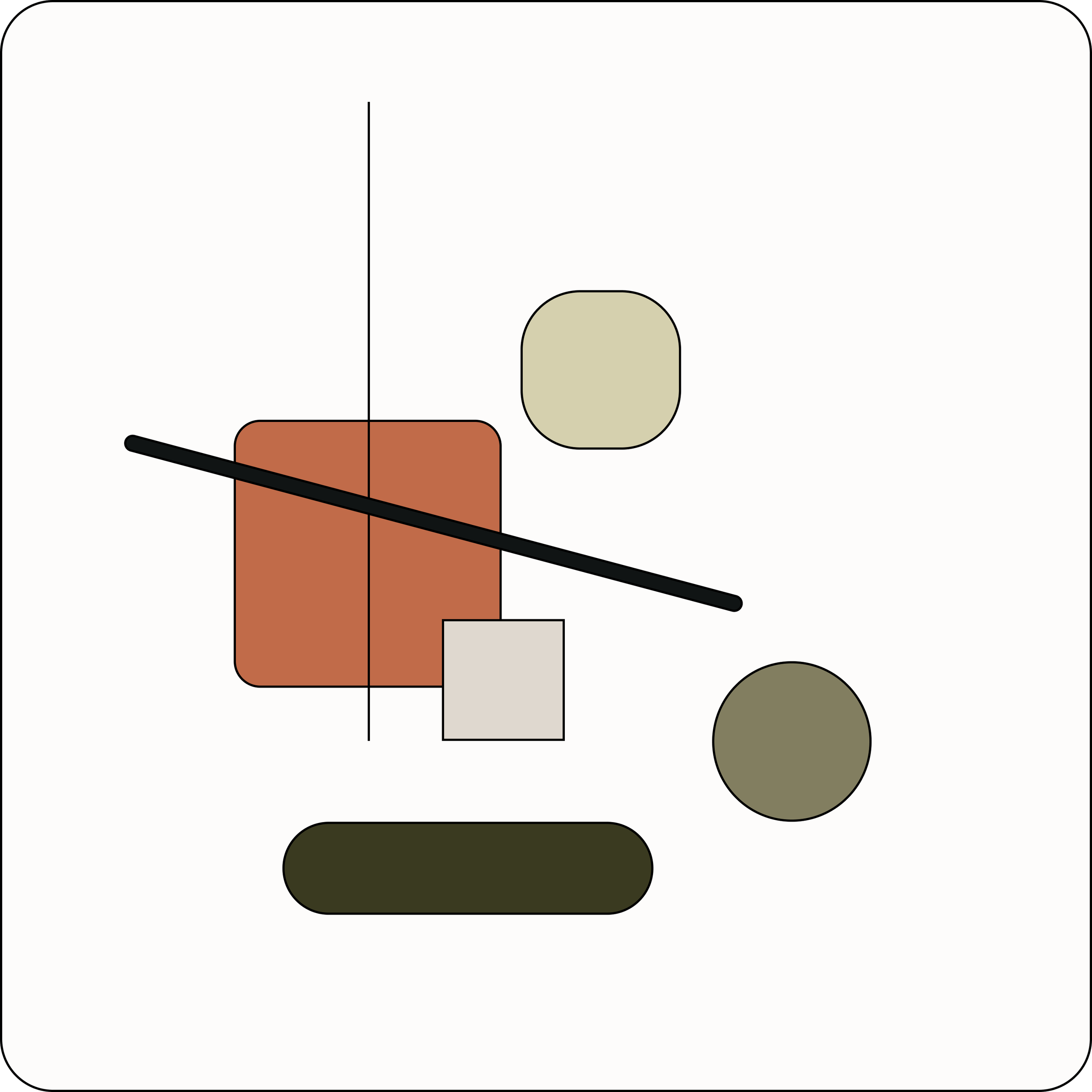
Composition Tile
This composition tile acted as a sample of how all the elements inspired from my mood board would work together in one composition. Some things to note are:
Rounded edges and shapes, to create a sense of friendliness and safety.
Thin line strokes, to provide some definition and separation.
Tons of white/negative space, to make the space feel breathable and bright.
Pops of color, to provide visual interest and vibrancy into the space.
Style Tile
I put all the elements together in this style tile, which offers an at-a-glance image of Sway’s new branding direction.
I chose to match a stylized header font with a modern and friendly sans-serif font. I felt the pairing brought a cool vibe to the brand, which was lacking in Sway’s old site (it had more of a generic tech-vibe).
The typography choices were made to, again, bring a sense of warmth and friendliness to the digital space, and creating that “community club” vibe that the business owner was chasing after.
Working on Wireframes
Prototype
Drafting the wireframes for this website proved to be challenging to me, because I ended up having many ideas that made me incredibly indecisive. I had trouble coming up with a site design that accurately represented Sway’s wide array of services, and to make their disjointed brand all make sense. As a result, I had to work through a creative rut where I experimented with many designs to come up with an end product I was happy with.
Building a Testable Prototype
Prototype
Pushing through my creative frustrations, I persevered to create something that I could be proud of and that I could take into usability testing. As a result, I ran with some ideas I experimented with in my low- and mid-fidelity drafts. Once I determined Sway’s visual brand, I found that everything started coming together.
With the limited timeframe for this project, I was selective about what pages I wanted to spend my time designing. I designed wireframes for the:
Landing page, since it acts as the brand-defining home page on the site.
Workspace page, which acts as an example page that the Sway team could refer to when building out the other site pages.
Booking feature, which allows users to book both coworking and private rental spaces. I chose to focus on this feature because the old booking feature was difficult to use, which probably resulted in users abandoning their efforts to give Sway their business.
Rental Booking Feature
High-Fidelity Wireframes
Mobile Screens for Responsive Design
Prototype
Once I designed the desktop screens for Sway’s site, I translated those wireframes to mobile to visualize the responsiveness of the site. My goal was to make sure that the mobile version of the site would still feel like the desktop version, so that users would be at ease using mobile to explore Sway and book a workspace/private event using their phones.
I focused on creating mobile screens for Sway’s landing page, Workspace page, and the booking tool.
Testing & Iterating
With a prototype ready to be tested by users, I mirrored my usability testing off of what I used in my initial user research interviews, when I was initially auditing Sway’s existing website. This allowed me to directly compare user reactions to Sway’s old site and to Sway’s redesigned site.
Testing Objectives
I wanted to see if users could easily understand Sway’s brand/company and the many services they offer.
I wanted to see if users could better navigate the site and use it intuitively.
I wanted to gauge whether users found the the booking feature simple to use (for both workspace and private event rentals).
Method
Usability Testing Interviews
I conducted remote usability tests with 4 women and 1 man, ages 26–36 years old.
I had all users complete these three tasks on my prototype:
Usability Testing Interviews
Testing
-
Task 1
Explore the Landing Page and Workspace Page to learn more about Sway and their services.
-
Task 2
Book a standing desk in Sway’s coworking space on recurring days (using the booking tool).
-
Task 3
Submit a rental request for a private event (using the booking tool).
What Users Responded Well To…
Visual Branding
→ 4 out of 5 users responded positively about the site’s visual brand and aesthetics
Comprehending Key Info
→ 4 out of 5 users said that Sway’s services were clear from the landing page
→ 3 out of 5 users said that the site’s layout and navigation were intuitive
→ 5 out of 5 users appreciated having an FAQ section (on the Workspace page) for quick details
Photos of Sway’s Spaces
→ 4 out of 5 users noted that they loved having lots of photos of Sway’s venues and workstations to refer to
Iterations
Fine Tuning the Designs
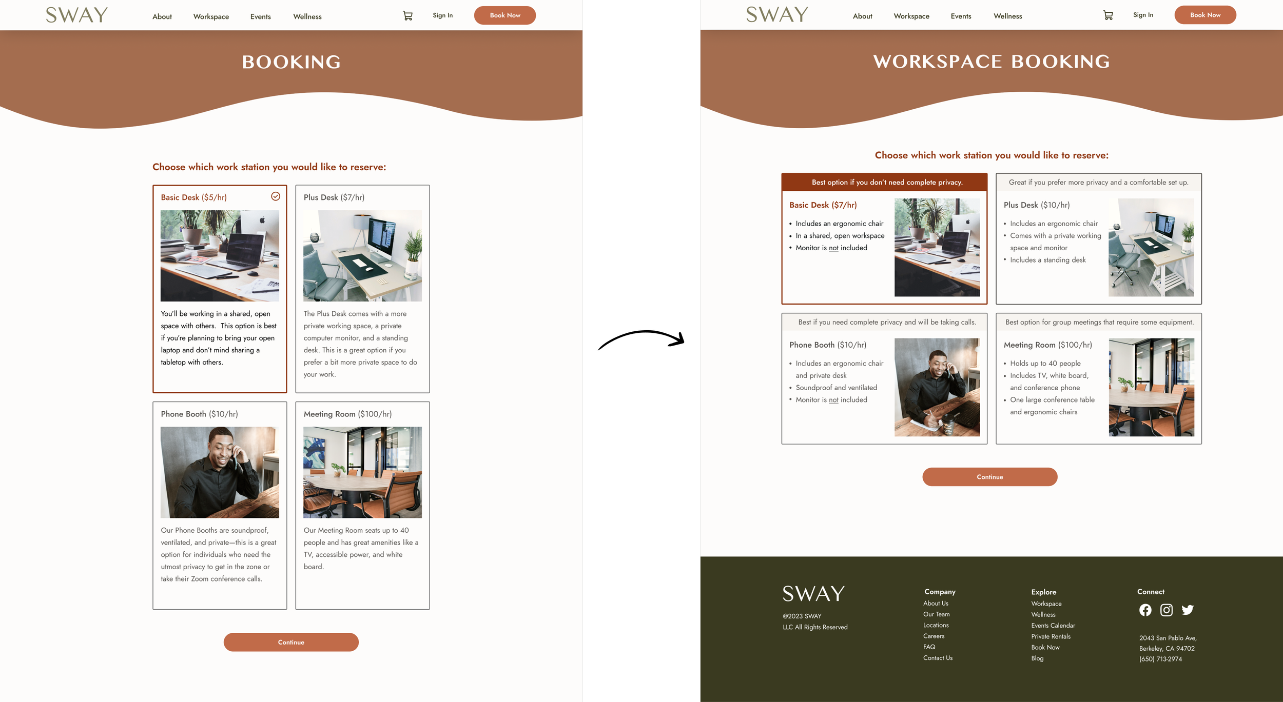
Refining the Work Station Selection Cards
→ 4 out of 5 users mentioned that the workstation cards in the workspace booking feature were hard to read quickly
“It will be easier for me to look at this page if you have bullet points, or if you highlight why this is a great option…then I can quickly compare [the workspaces].”
I changed the booking card to make it horizontal and reformatted the text into quick bullet points, so that users could easily scan the descriptions. I also added highlight text at the top of each card, to help users figure out what work station would be right for them.
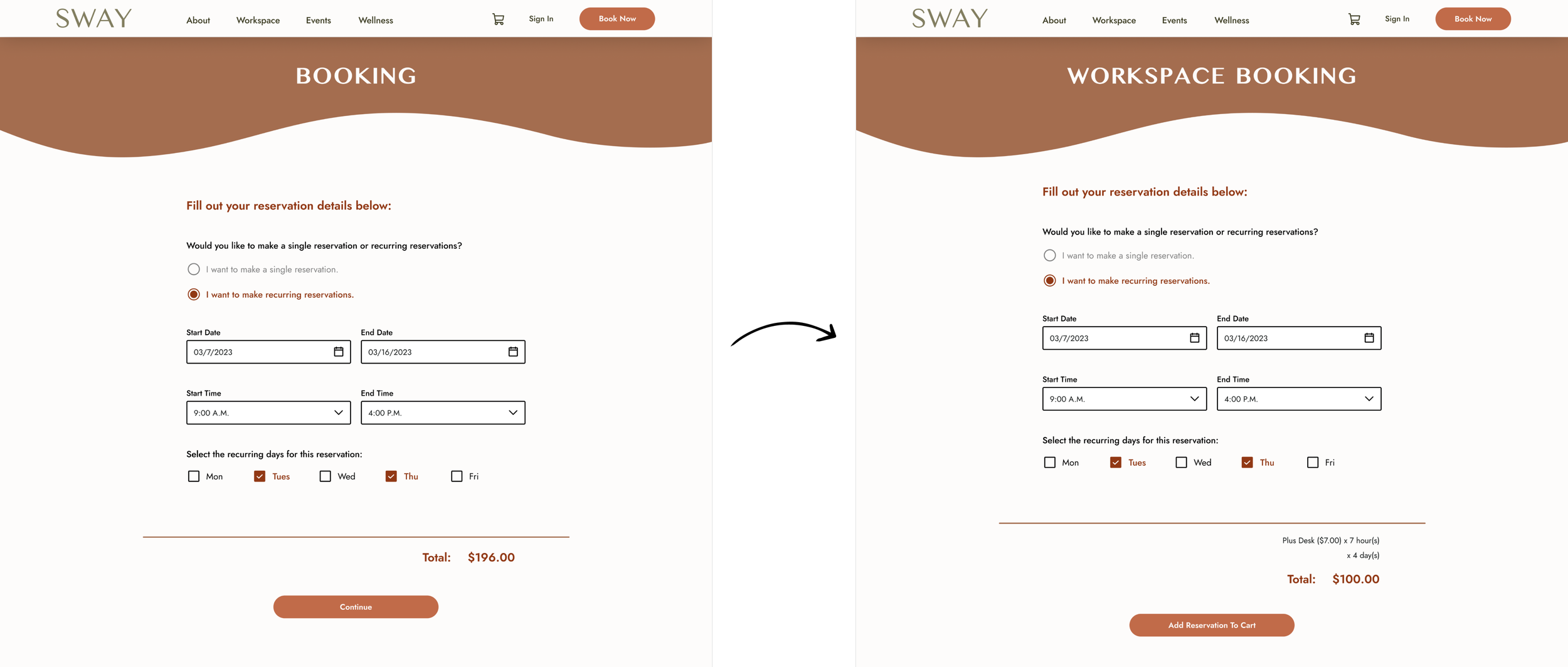
I also renamed the header of this form to “Workspace Booking” to distinguish this form from the Private Rental form.
Transparent Pricing Calculations
→ 3 out of 5 users said they wished there was automatic price calculation in the workspace rental booking, to make pricing more transparent
“I would have liked for more of a breakdown [of the workspace rental pricing]…I wish it could do the math for me.”
When testing, a few users were shocked by the workspace rental prices, and they said it might help if they could understand how the total was being priced out in real time. I added this information at the bottom of the form to make the pricing more transparent for users.
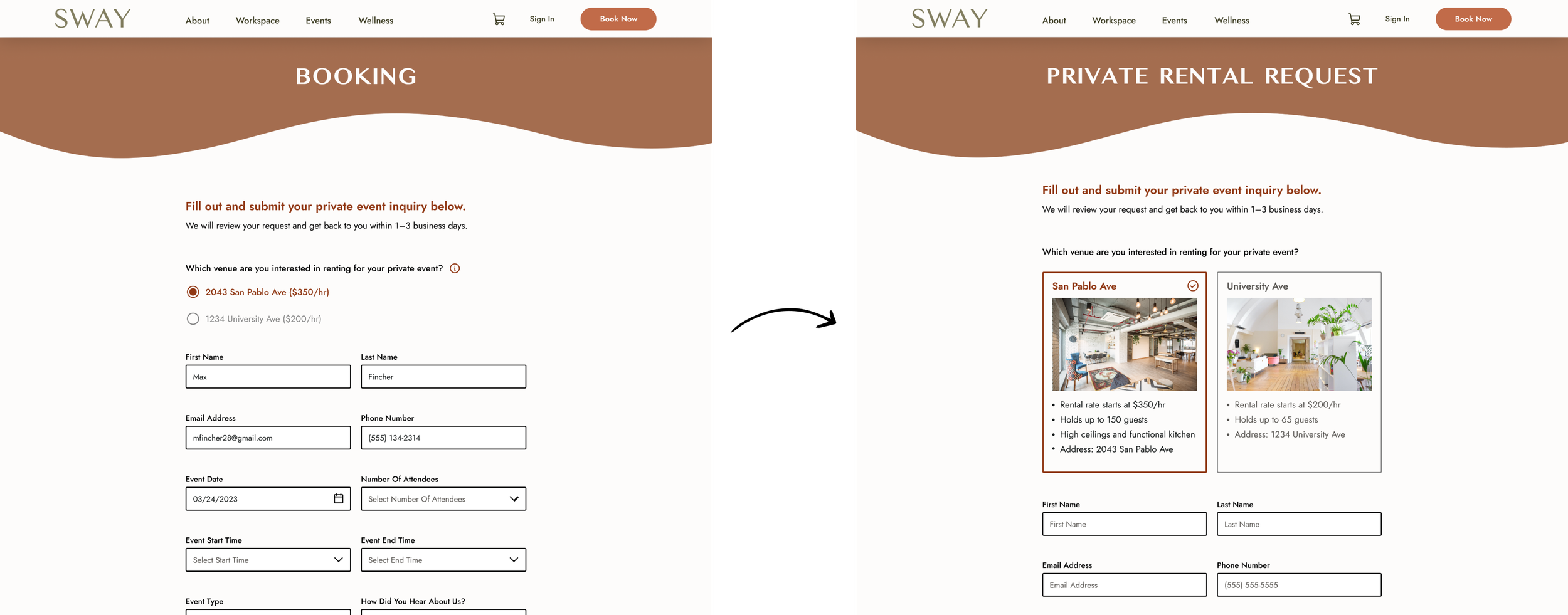
Tweaking the Private Rental Request Form
→ 3 out of 5 users said they wanted pictures and pricing of the different venues when filling out the private rental request form
“I [would prefer the venue info not to be hidden in the hover icon]. And I would also want a picture here, too, like a location name key like two key facts, whatever the most important ones are.”
In my initial designs I had key venue information hidden in a hover info icon. But through testing, users said they would prefer to have that information not tucked away. I added in pictures of Sway’s different venues for users to choose from, along with key venue information like pricing, location, and capacity.
Additionally, I renamed the header of this form to “Private Rental Request” to distinguish this form from the Workspace rental form.
Final Thoughts
Overview
This project gave me the chance to work with a real-world client. I definitely encountered bumps in the road while working with Sway, but I think that made this project feel more real. Real-world projects are rarely ever linear, and rarely do they ever go as planned. The chance to work with a real business—and to gain the experience of understanding their business goals and issues—gave me invaluable practice (and learning lessons) that I’ll take along into my future UX projects.
What Went Well
I developed a coherent and inviting brand for Sway, which feels less cookie-cutter/generic and more community-based and welcoming.
I designed a new website that alleviated many problems that Sway’s old website had. The new website design makes navigation and completing tasks easier for users.
My initial research interviews/guided website audit proved incredibly fruitful, and allowed me to really concentrate on the areas of the site that were causing users the most frustration.
What Could Have Gone Better
At times I found it difficult working with my client, mostly due to them not providing me enough information about their business (like info about their services, pricing, etc.) so I could make better-informed decisions on my designs. They were also on a time crunch, so there was some pressure on me to finish this project quickly.
I went through a big creative block around mid-way through this project. I couldn’t make up my mind on how I wanted to design the site, and so I just kept experimenting until I felt creatively exhausted. I did push through this mental block, and in the end I felt happy with what I created.
Due to COVID-19 limitations, I wasn’t able to physically visit Sway’s space. I would have loved to do more research by observing Sway’s customers in the actual space. This might have changed how I would have approached my design of Sway’s new branding and site.
Next Steps for this Project
I would focus on designing the Wellness and Events pages so I could work on how events/classes are shown on a calendar, and design an easy way for users to RSVP for events and classes.
In my usability testing, users still were confused about Sway’s price points (they expressed their pricing was too high). I would want to work with Sway to get a better understanding of their pricing model so it can make more sense for users on the site.


